Week 22/26: Landscape
When I was about 10 or 11 we had a cheap little film camera. I don't remember being given it, so it probably was shared by the family. I have early pictures I took with that camera, none of them very earth shattering, mostly pictures of family members. However my earliest memories of my photography was when I was standing with my camera in front of a wonderful landscape. I remember more than once thinking how beautiful the scene was and taking two or three photos. Weeks (months?) later when the film went in to be developed, the black and white pictures came back. I remember looking at them and wondering why I had taken them. Somehow that breathtaking landscape of rolling tree covered hills had turned into a dull scene, totally lacking interest.
No one ever explained to me how to choose and frame a subject (landscape or otherwise) that would look good in black and white. No one told me that simple clean lines look great A landscape of stark tree trunks and branches against snow or fog would look wonderful in black and white, no colour needed at all (no fussy leaf masses) as do dramatic skies behind a subject, that no matter how striking the colour of the leaves you see before you, that colour will have little impact in the printed image. No one told me any of those things and we certainly couldn't have afforded colour film at that time. Neither did I have access to a darkroom, to the tools that would have allowed for creativity, such as dodging and burning, to bring out dramatic skies and highlight subjects. So every time the prints came back, I was bitterly disappointed.
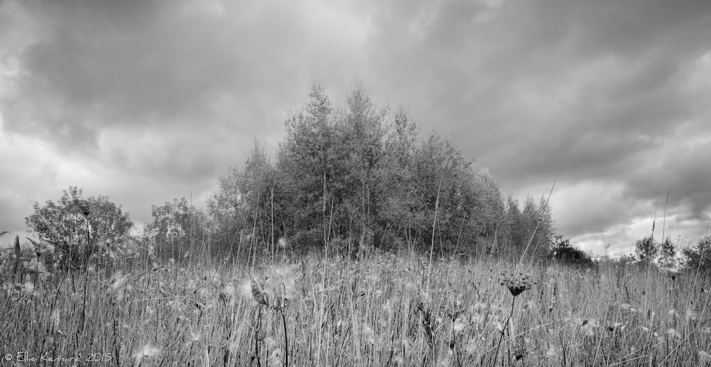
This challenge then immediately brought back those memories, but spurred me on to try to find a subject where colour was secondary to the composition. At this time of year, with brilliant foliage everywhere and as I could't get to a seashore (my first choice) I found this proud stand of trees in the field behind our house, in front of gathering evening clouds. In the foreground is a potential monarch butterfly nursery* for next year, seed heads of the common milkweed plants.
*As an aside, the invasive common milkweed is not the best plant for the butterflies, they much prefer the non invasive marsh milkweed, which I am planting next year.
My posts are all on my blog: https://www.elliekennard.ca.
#BWProject26 | Curated by +Tisha Montgomery +Brandon Luk +Lauri Novak +Al Chris
1205